I was reminded by editor Graydon Carter that this was his last issue of Vanity Fair. It took me a long time to read this issue. It was so long that the new issue appeared on the racks at the checkstand before I had finished reading this one. “Whoa!” was my reaction. The new issue has a completely different look.
Let’s review the Graydon Carter era style.
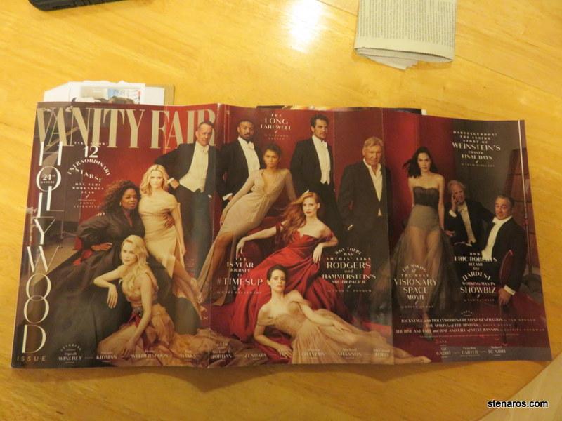
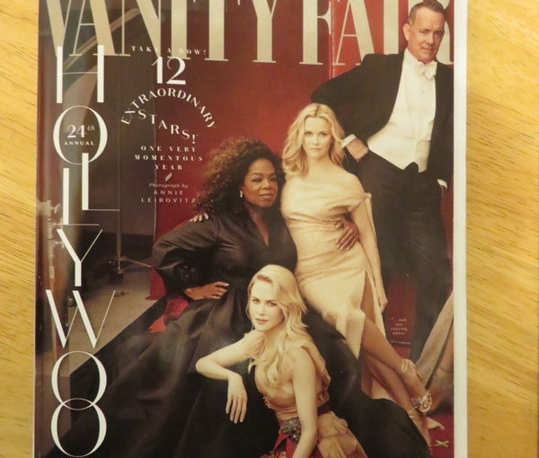
This is the classic Oscar Issue, where the page folds out to show a variety of big Hollywood actors, some of which have not been nominated for Oscars, presumably because they shoot the spread earlier than the nominations are announced.
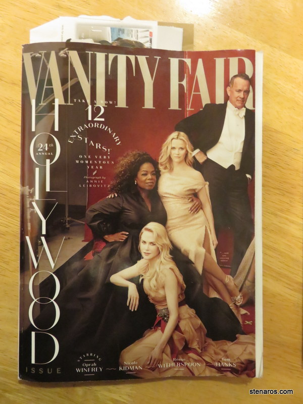
We’ve got full-body spreads, and floating type. A quick Google Image search of “vanity fair covers” shows that while there are some face-only covers, most of them are either from the navel up, or full body shots. There’s also a bold use of color and lighting that makes things crisp instead of arty.
I also love finding the tiny type quote on the front of every cover. This one says: “One may understand the cosmos, but never the ego; the self is more distant than any star.” –G.K. Chesterton. The quotes sometimes add extra illumination to the person on the cover, or a story listed on the cover.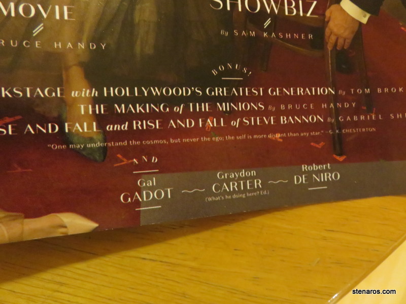
Here’s the new cover, with editor Radhika Jones at the helm.
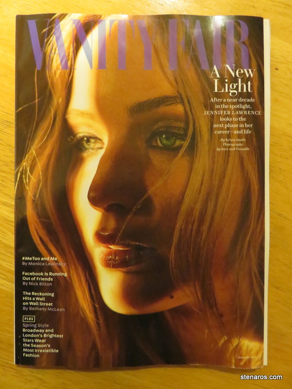 It’s so very different! Even though (I’m pretty sure) it’s taken by the same photographer. We’ve got a very close-up picture of Lawrence’s face, a very soft focus and half in shadow. Our floating text has disappeared, herded over to the sides of the cover. Compare this picture with the last time Jennifer Lawrence was on the cover in 2016.
This new cover was simultaneously off-putting–it’s Vanity Fair, not an art magazine!–and also instantaneously made the old style of covers look really garish and out of date. I’ll probably settle into this new style, but I will miss hunting for the tiny quote on the cover.
Side note: it used to be that when I was subscribed to magazines, my subscriptions would arrive before the magazine appeared on the newsstands (or, since there aren’t really newsstands anymore the racks in the checkout line at the grocery store.) Now, I see the new issue on the stands sometimes two weeks before my copy arrives in the mail. I can’t tell if this is just a Vanity Fair thing, or if there’s some new magazine strategy wherein magazines are hoping subscribers will purchase the magazine forgetting it will be arriving in the mail. At any rate, I think subscribers should be rewarded by having the first crack at the magazine, not have to be the second-class citizens waiting.
Found it! I will be back…hopefully soon.
Oh you are right…very different covers! As a non-Vanity Fair reader I was quite intrigued by your post. It is rather sad to lose the small quotes. They are quite fun.
Greetings from a very very chill 4th of July at our house. We are about to go out for a walk but have stuck close to home all day and are likely NOT to take in any fireworks. Odd, but it is true, that we just don’t feel like it tonight.